|
|
|
|
|
|
|
|
|
|
|
|
|
|
|
|
|
|
|
Update 7-00:
The Caps have announced that the new jersey has been scrapped! So, we'll be looking at that diving eagle and the yucky asymmetrical stripes for another year.
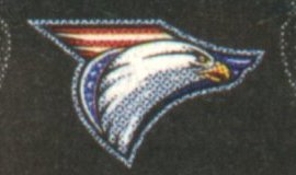
6-13-00: Is this what we'll all be wearing next season????

From the Ocean Hockey catalog. Well, at first glance I said "blech"--ugly. As I've looked at it more and more, I don't hate it; in fact, it's not all that bad looking. I like that they've reverted to the straight across the bottom striping, and the yoke isn't bad. I would have preferred straight striping on the sleeves instead of the slant, but can live with that. My main gripe is with the asymmetrical logo--very Pred, Wild-like. If they had made the logo more round but still incorporated the same design elements, this jersey would be great. As it is now, it's ok. It's growing on me the more I look at it. Of course, the image in the catalog is not a photograph, so I'm sure the jerseys will look better in person. I'm curious to see what the fonts for the lettering and names will be. And I'm not so sure I like that logo on the shoulders (though it's very hard to see). Doesn't look like they'll be incorporating the Capitol dome logo, which I really really liked way better than the eagle. Oh well!
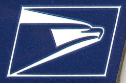
Some have mentioned the similarity of the new logo to the USPS logo:
|
|
|
Hmmm. I guess I can see it.